I’ve recently been thinking about ways to do graphs on the CLI. We’ve written a new Puppet Agent for MCollective that can gather all sorts of interesting data from your server estate and I’d really like to be able to show this data on the CLI. This post isn’t really about MCollective though the ideas applies to any data.
I already have sparklines in MCollective, here’s the distribution of ping times:
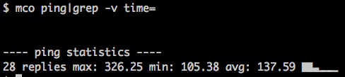
This shows you that most of the nodes responded quickly with a bit of a tail at the end being my machines in the US.
Sparklines are quite nice for a quick overview so I looked at adding some more of this to the UI and came up with this:
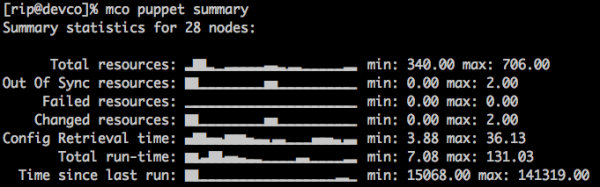
Which is quite nice – these are the nodes in my infrastructure stuck into buckets and the node counts for each bucket is shown. We can immediately tell something is not quite right – the config retrieval time shows a bunch of slow machines and the slowness does not correspond to resource counts etc. On investigation I found these are my dev machines – KVM nodes hosted on HP Micro Servers so that’s to be expected.
I am not particularly happy with these graphs though so am still exploring other options, one other option is GNU Plot.
GNU Plot can target its graphs for different terminals like PNG and also line printers – since the Unix terminal is essentially a line printer we can use this.
Here are 2 graphs of config retrieval time produced by MCollective using the same data source that produced the spark line above – though obviously from a different time period. Note that the axis titles and graph title is supplied automatically using the MCollective DDL:
$ mco plot resource config_retrieval_time

                   Information about Puppet managed resources
  Nodes
    6 ++-*****----+----------+-----------+----------+----------+----------++
      +      *    +          +           +          +          +           +
      |       *                                                            |
    5 ++      *                                                           ++
      |       *                                                            |
      |        *                                                           |
    4 ++       *      *                                                   ++
      |        *      *                                                    |
      |         *    * *                                                   |
    3 ++        *    * *                                                  ++
      |          *  *  *                                                   |
      |           * *   *                                                  |
    2 ++           *    *                         *        *              ++
      |                 *                         **       **              |
      |                  *                       * *      *  *             |
    1 ++                 *               *       *  *     *   **        * ++
      |                  *              * *     *   *     *     **    **   |
      +           +       *  +         * + *    *   +*   *     +     *     +
    0 ++----------+-------*************--+--****----+*****-----+--***-----++
      0           10         20          30         40         50          60
Config Retrieval Time |

So this is pretty serviceable for showing this data on the console! It wouldn’t scale to many lines but for just visualizing some arbitrary series of numbers it’s quite nice. Here’s the GNU Plot script that made the text graph:
set title "Information about Puppet managed resources" set terminal dumb 78 24 set key off set ylabel "Nodes" set xlabel "Config Retrieval Time" plot '-' with lines 3 6 6 6 9 3 11 2 14 4 17 0 20 0 22 0 25 0 28 0 30 1 33 0 36 038 2 41 0 44 0 46 2 49 1 52 0 54 0 57 1 |
The magic here comes from the second line that sets the output terminal to dump and supplies some dimensions. Very handy, worth exploring some more and adding to your toolset for the CLI. I’ll look at writing a gem or something that supports both these modes.
There are a few other players in this space, I definitely recall coming across a Python tool to do graphs but cannot find it now, shout out in the comments if you know other approaches and I’ll add them to the post!
Updated: some links to related projects: sparkler, Graphite Spark
